Blog #1 - Close Looking Exercise
Close Looking is a skill we are using in my course that focuses on looking at, interpreting and analyzing works. This blog and others will be formatted on the steps of close looking: Looking, Describing, Thinking, and Connecting. For this blog, I was to choose 3 artworks and use these steps to analyze them.
Piece 1: Barses and Zilants by Dashi Namdakov (particularly the “Mother”)
Describe…
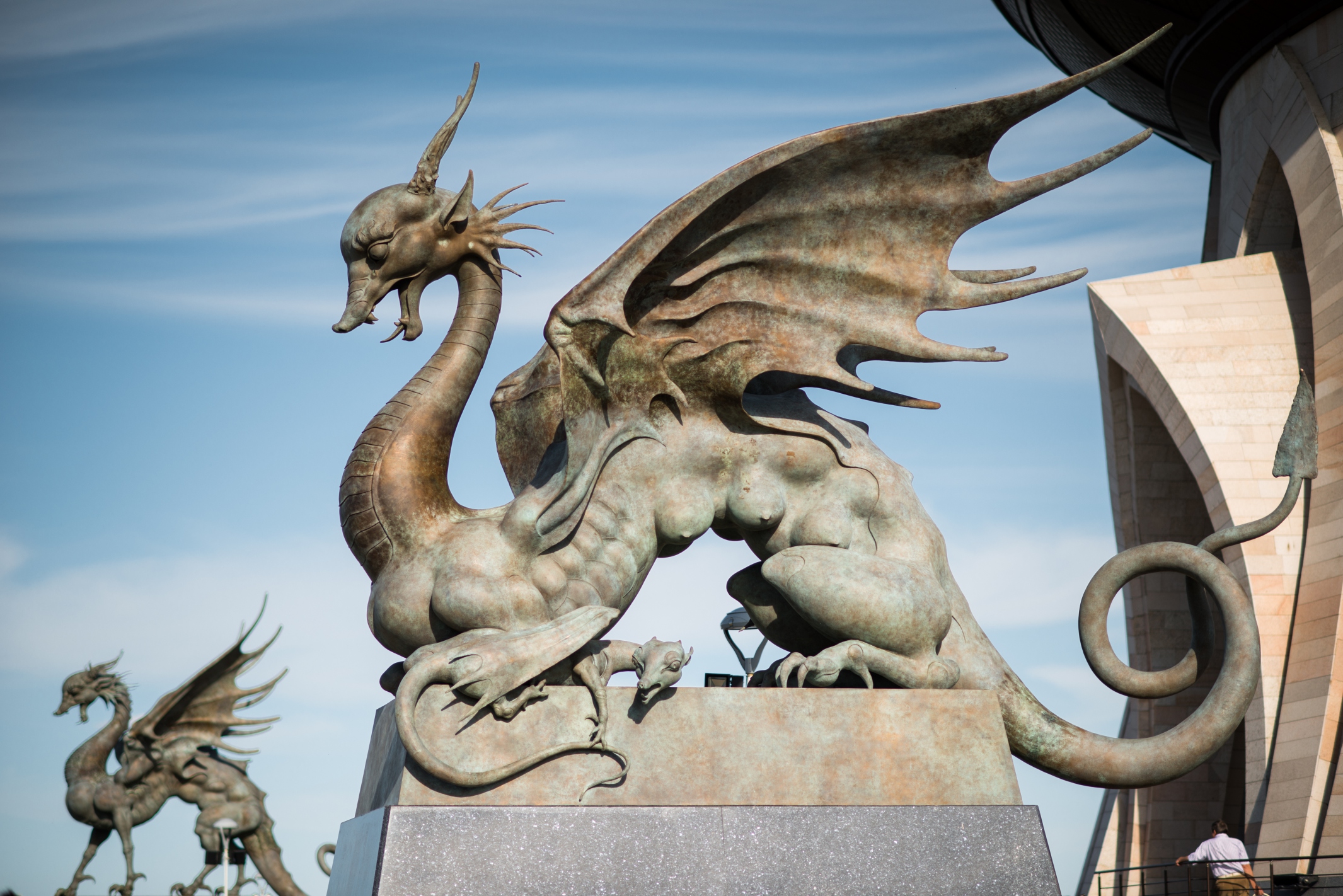
The specific sculpture out of the four from the group is the Mother Zilant. She is a bronze cast sculpture depicting a motherly zilant with her little cubs. Her mouth is wide with a powerful roar, watching over and defending her babies, who cower at her feet. The horns on her head are almost deer adjacent at the base, warted as if they are able to be shed, and the fins on the sides of her face below her ears are almost reminiscent of a sea urchin. The zilants, who seem to often be portrayed in art as more reptilian or draconic with their dragon wings and snake-like body, are depicted in these sculptures with breasts like a mammal. The mother seems to have larger breasts than the other zilant, as they most likely are to be thought of as full of milk for her cubs.
Think…
On his website, Namdakov tells us that this set of sculptures have been displayed in many cities around Russia, but the architecture and its “bowl” that originally inspired the set of sculptures is described as symbolizing “a large bowl of nomadic ancestors” and uniting people through a similar purpose and reason. The architecture is meant to be a symbol of unity and mutual understanding. Related to that idea, these sculptures in their specific locations within their display site, are a homage to their roots of being integrated within the ancient culture and legends of the Tatarstan people. The zilants serve as guardians of the bowl, and are positioned in a pair adjacent to the two statues of the barses (which I didn’t highlight on, sorry…) near the “Family Center,” which ties to them being symbolic of guardians and patrons of the children, as well as symbols of long-winded family traditions and marriages. The mother zilant in particular displays the child patron symbolism; her fragile and meek cubs at her feet are to represent the thing that they are not yet but will be. They may not have grown into their wings quite yet, but they have all of the might to live out their full potential, all while supported and protected by their mother zilant, who is depicted as strong, proud, and powerful yet nurturing, tender, and loving.
Connect…
The animalistic connections throughout this piece are so interesting to me, specifically the way that the mother zilant is portrayed with many different mammalian features. Zilants are legendary creatures from Tatar mythology. They are somewhere in between a tie of a dragon and a wyvern and possess the body of a bird, legs of a chicken, tail of snake, wings of a bat, and head of a dragon. They’re frequently depicted in art with shiny black scales and large red wings. In this piece, the mother zilant’s neck and parts of her face still have reptile-like characteristics. But I see many parts of her that strike me as more of mammal-like features. The ears and horns on her head are almost cervine and remind me of those of a deer, her upturned nose is reminiscent of that of a mole’s or a bat’s, which ties the chiropteran connection to her large bat wings. Her feet are similar in my mind to those of some type of marsupial, as well as her tail as one of an opossum (that is, except for the traditional imp-like triangular tip of her tail). I particularly like her tail, as it does resemble that of an opossum, who carry their babies on their bodies and are notoriously good mothers, and she is in fact a motherly zilant who is watching carefully over her cubs.
Piece 2: Negora Invades Shibuya City by Konatsu

Describe…
This illustration features a vibrant cityscape stylized with Konatsu’s graphic and colorful flair. The city is amidst its own destruction, being terrorized by a large cat kaiju: one of Konatsu’s original characters named Negora that is featured throughout her art. Negora is paying references in her design to Godzilla with her spiked back fur and sharp teeth and claws. Her mouth is gaping open and spewing a wave of flames over the city, engulfing the skyscrapers in blazing orange fire and billowing black smoke. The billboards, buildings, streets, and signage amongst the carnage are being vandalized by other cat characters doing various things, such as poking their heads through the signs, crawling between and on top of billboards and buildings to catch mice, playing musical instruments in the windows of the skyscrapers, eating onigiri on rooftops, buying and eating takoyaki from a food stand run by an octopus, and jumping in and out of and up and down through the windows and doors. The colors are saturated and feature lots of warm hues.
Think…
I’m not sure if there was too much of an underlying message in this specific piece by Konatsu. I’m pretty sure this piece was made by her for an exhibition of her artwork that was happening. Nevertheless if it has deeper meaning or not, I love all of the little cultural details in this piece, specifically the integration of Japanese cuisine. There’s many different references to a variety of different types of food; a ramen stand where a cat is eating steaming ramen noodles with chopsticks, a takoyaki stand run by an octopus and a taiyaki stand with a fish vendor, a sushi restaurant being robbed of their nigiri sushi, and a cat sitting and eating some onigiri. All of these foods are either common street foods or a popular Japanese dish, so they display almost a motif throughout different media and art as symbols and examples of Japanese culture through their cuisine. Konatsu, in including these little symbolic references in her piece, ties together her kaiju theme with the theme of food centric street life.
Connect…
I love this artist SO much!! Konatsu’s work is so vibrantly creative, saturated in both color and stylistic whimsy, and just a bit abnormal which is something I always love to see in art. I think what I like so much about her art is how it ties to the pop culture of Kaiju characters. Kaiju, or “strange beast”, are monsters depicted frequently in Japanese media and embody a subgenre of monster films and literature. They are portrayed in many different ways; various sizes, origins, etcetera, and are almost always destroying civilization and societies. The story often then branches into the societies being defended from the Kaiju by the Japan Self-Defense Forces, a different Kaiju monster, or both. These films often present political commentary in both the background and the foreground as well as the action that is front and center. The kaiju themselves very frequently serve as metaphors for disasters: for example, Godzilla, who is a huge blueprint for many many kaiju films, was originally a metaphor and representation of nuclear weapons and fear that Japanese citizens had in their nation post-war following the bombings of Hiroshima and Nagasaki. I love how Konatsu takes these frightening characters that also feature deep political commentary and makes them cute and silly, making their serious counterparts in the media a character that is slightly frightening but who is supposed to be adorable. Her choice of cats is sweet and endearing, and has featured many dog characters as well, sometimes alongside or fighting against the cats. She also makes sculptures of these kaiju characters that are painted with colorful patterns and a large range of bright, saturated hues.
Piece 3: Jolly Rancher by Ben Frost
Describe…
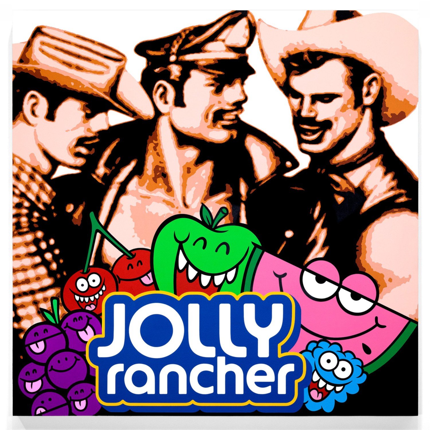
The painting features two major parts in the foreground and background of the composition. The background focuses on an image of three male figures, two of which in cowboy hats and the other in leatherman attire. In the foreground, the logo for the candy Jolly Rancher is front and center, as well as the characters from the packaging. This piece was painted with acrylic and spray paint on an artboard. The board is on the larger side at 68x68 inches.
Think…
From what I collect in my own sense of meaning, this piece has a title related meaning as well as a strong connection to other works. The three men in the background are reminiscent if not a mirror of art by Tom of Finland. Touko Laaksonen, better known as “Tom of Finland” or just “Tom” was a highly influential queer artist who emerged in the late fifties. His art featured lots of stereotypically masculine men in various variants of leather attire, and was homoerotic and heavily laced with sexual themes, which led to titling him as one of the pioneer artists who contributed to the Leatherman image and era. His art has been referenced throughout countless other pieces and within various genres and types of media throughout the years and still to this day. The figures featured in this piece (two cowboys and a Leatherman) ties to the title of this work of “Jolly Rancher,” not just because of the literal brand’s logo in the foreground, but possibly because of the implications of the three men being “jolly” out of arousal. The dramatic stylistic contrast between the colorful, blocky, and graphic logo in front of the almost blurry, sepia tinted figures behind it remind me of a polaroid photo with a sticker slapped on top. Jolly Rancher’s brand is very colorful and fun; the candies being fruit flavored makes it easy for the company to do their branding featuring more tropical colors as well as fruit themed characters. Seeing these silly characters on top of the artwork in the background adds further to the contrast I previously mentioned, and almost pops them from the foreground.
Connect…
I’ve already drawn connections between works in the previous Think category, so I wanted to include some information about this artist. Ben Frost is one of my favorite artists as of late, specifically for his paintings on old reused packaging. He takes boxes, bags, and other paper packaging and paints pop art styled images onto the surface. Some of my favorite ones from this series are the ones he created on McDonald’s fry boxes, such as “No More Tears” and “Sweet Memories” that feature retro comic style faces of women. Another favorite is titled “Rush” and features a crying woman in a similar comic style painted on a package for a fentanyl injection. I love how Frost uses pop culture imagery in his art, using branding and logos as integrated elements of his work. A lot of his work is providing commentary on political and societal issues, specifically on entertainment and advertising.